
Showing posts with label Evaluation Question 1. Show all posts
Showing posts with label Evaluation Question 1. Show all posts
Thursday, December 17, 2009
Evaluation Clips
We have chosen some clips from our music video to go with the evaluation. At various points in my answers to the evaluation questions I have mentionned time codes when discussing specific clips from our video and these refer to the above video which contains those clips.
Conventions of Music Videos (Points time-coded and related to Evaluation Question 1)
According to Andrew Goodwin
• Demonstrate genre characteristics
- Concept based, abstract
- Quirkiness, weirdness – leaves going up (0:00) masked figure (0:03)
- Mystery, ambiguity – not revealing masked figure shots (0:05)
• Relationship between lyrics and visuals
- Mostly amplification
- Illustration –‘play my ace’ shot (0:11) and ‘eyes on fire’ shot (0:13)
• Relationship between music and visuals
- editing to the beat – waking up (0:19), fire (0:21), mask on/off face (0:24)
• Close-ups – CU shots (0:28)
• Voyeurism
- In the sense of watching – mirror shots (0:34), masked person in background at beginning (0:36)
- Challenged the voyeuristic treatment of the female body – not sexualised
• Intertextual references - Alice in Wonderland, ET,
According to Carol Vernallis:
NARRATIVE
• The narrative is not complete, is partial and disjointed, no closure, ambiguous
• Disjointed structure – different locations, not continuous in forest, jumps around for example the shots in the tunnel near the end(0:39)
• Driven by the enigma, the mystery
• Poses questions – What is happening? What does the masked person represent? (from the beginning when the masked person is in the background)
• Very thematic – self-discovery, obsession, multiple personalities
EDITING
• Editing to the beat – waking up(0:19), fire (0:21), mask on/off face (0:24)
• Broke rules of continuity editing – cutting within lyrics, 30 degree rule
• Is fore grounded – beginning trees out of focus ‘blinking' (0:42)
• Style – beginning is dreamy, then cuts to the beat
CAMERA MOVEMENT
• Extreme shots used and placed next to each other - CU to LS (0:47)
• CUs used frequently and master shots within sections
• Camera does not move in time with music or lyrics – we challenged this
DIEGESIS
• Revealed slowly – revealing shots of masked figure (0:05)
• Masked figure moves to the music when running – running shot (0:51)
• Gaps in audience’s understanding
• Repetitions of trees, certain close up shots, hands against tree and wall shots (0:54)
Wednesday, December 16, 2009
Sample Analysis Chart - Evaluation Question 1
In preparation for our evaluation we filled in these analysis grids that outline the conventions of music videos according to Andrew Goodwin adn Carol Vernallis. We also looked at the conventions of album covers and band/artist website homepages. Here is a sample of an analysis chart I filled in:

Evaluation Question 1: In what ways does your media product use, develop or challenge forms and conventions of real media products?
Reflections
I led the discussion to this question and I think we covered most of the points quite well as a group as we spent the longest time on it. We refered to specific shots in our discussion so I have included my notes with the time codes even though we covered these points in our discussion. There were points that I wanted to bring up however I think we managed to cover them as a group. I do have some additional points to add about our album cover and Myspace.
Additional Points
Music Video
We compared our music video to Panic at the Disco's music video for 'I Write Sins Not Tragedies', which can also be classified as alternative/indie rock.
There are many similarities between the music video we created and the music video for this single as they are both conceptual and abstract but also contain performance and narrative.
- Our video features a masked person while this video features characters with painted white faces and this element makes the video quite surreal and different. This weirdness is a signifier of the alternative/indie rock.
- The idea of these strange charaters crashing a normal situation (a wedding) again makes the video quirky and surreal and so transports the viewers into another world as our video does through the concept delivered by the masked figure and the shot where the leaves blow upwards.
- The performance in both is often angry,aggressive and powerful. This is also often evident in the perofrmance aspect of videos in this genre.
We compared our music video to this one as well. The video is quirky and unique to the style of the artist. We particularly liked the angles of some shots and shots where the camera was placed on the ground. The artist is blindfolded for a while and then takes the blindfold off, which signifies her stepping out of her ignorance as she becomes aware. This can be compared with the beginning of ours where the girl wakes up and as she walks around she finds out more about herself through the masked figure.
Album Cover
I have listed six of the main conventions of album covers below and analysed whether we have
• Layout/form
– Front: artist (poster cartoon effect), artist and album name
– Back - track listing, institutional information
– Front and back link through colour scheme, font
• Genre signifiers
- artistic and distinctive
- quirky and unique
• Visual representation of music
- Fears, entrapment, extremities
• Branding of the artist
• Institutional identity
- Staple Records
• Purpose/functions served
- Portrays artist artistically
- Identifiable and distinctive image
- Promotes the artist
Florence And The Machine Album Cover

I would say this album follows all of the above conventions as it is a unique, artistic portrayal of the artist.
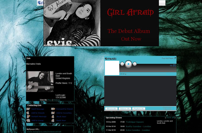
MyspaceWhen creating the artist homepage, which we did as a Myspace page, we looked at the conventions of band/artist homepages, mainly Myspace pages. This is split into four areas:
1. MEDIA LANGUAGE
- There is usually a relationship between the image and the text – The colour of both the image and text match as they are a dark green/blue. They show consistency in this way
- Blue and green, grass and trees – a sense of the natural elements, authenticity in terms of the artist and her style of music, very atmospheric and in terms of representing the genre it is different and distinctive, which reflects alternative rock/indie
- Satisfied through – upcoming shows, interactivity, can become a friend, can message her, information about her, behind the scenes pictures, can leave comments, can watch the music video, blog entry, pop out player
- Record label (is independent, matches marketing activity), management, album ‘out now’,
- Marketing activity – specific to independent record labels and so matches the label

Her Myspace is very interactive as fans can become a friend, send a message and watch videos Kate Nash has picked to represent her.
The background - black and white checks - is simple but also quite retro and original. It reflects her music as original and her lyrics as straightforward and 'real'.
Subscribe to:
Comments (Atom)
