
Today we had our screening at lunch. We invited people through facebook and had quite a good turnout of about ten people. We handed out questionnaires and also had a more focussed discussion after the screening with those who fitted the profile of our target audience the most and would want to buy the single or watch the video again.
Generally the feedback was very positive and watching the audience's reaction, I think we got the desired reaction form them as some were quite frightened by the video and found the video and the performer very creepy.
The audience seemed ot get the main concept of searching for something and a sense of confusion and being lost.
A big favourite was the fire spinning, particularly the first shot of this where the fire appears to blow upwards in time to the music where the beat kicks in at 1:53.
There is more about our feedback on the group blog as well as a post with the questions we asked people on the questionnaire.
One question was asking what other videos this reminded the audience of and somebody mentionned Panic At The Disco - 'I Write Sins Not Tragedies', which is a video we took inspiration from quite early on in the project.
Monday, December 7, 2009

Wednesday, December 2, 2009
WE ARE FINISHED :)
We had our screening in fron of our media class yesterday.
This was the main feedback:
They liked a lot of the shots, particularly in the forest with the light streaming through the trees.
The performance by Mia was really, really good.
They liked the way we made the audience feel confused and disorientated.
It was good how we didn't reveal certain things straight away.
They would want to watch it again (repeated viewings!)
There was one blurry shot of Mia near the beginning they thought was too blurry.
The ECU shot of Mia opening her eyes was slightly out of time for the line 'Eyes on Fire'.
We have now made the suggested change and out the ECU shot in time with the music. We did not chnage the blurry shot of the girl as we all felt that it was an effective shot and just added to the feeling of discomfort and uneasiness of the audience.
This was the main feedback:
They liked a lot of the shots, particularly in the forest with the light streaming through the trees.
The performance by Mia was really, really good.
They liked the way we made the audience feel confused and disorientated.
It was good how we didn't reveal certain things straight away.
They would want to watch it again (repeated viewings!)
There was one blurry shot of Mia near the beginning they thought was too blurry.
The ECU shot of Mia opening her eyes was slightly out of time for the line 'Eyes on Fire'.
We have now made the suggested change and out the ECU shot in time with the music. We did not chnage the blurry shot of the girl as we all felt that it was an effective shot and just added to the feeling of discomfort and uneasiness of the audience.
Friday, November 27, 2009
Finished!
We have now (unofficially) finished our project!
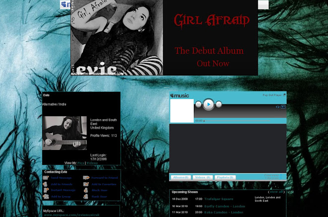
That includes our music video, album cover and myspace homepage for our artist.
We will have a screening with our class next Tuesday and then make any changes we need to...and then we are DONE!!!
That includes our music video, album cover and myspace homepage for our artist.
We will have a screening with our class next Tuesday and then make any changes we need to...and then we are DONE!!!
Tuesday, November 24, 2009
Editing, Album Cover and Myspace Page
This week we have been working on editing the music video as well as the album cover and myspace page as the deadline draws closer (Friday).
We have decided now that the name of the artist will be Evie and the album cover is called 'Girl Afraid'. We are going to play on the idea of fears with the visuals on the cover of the album as this will tie in with the title and a theme of the music video. We still need to decide on an effective shot for the front cover of the album. We already know that the back will consist of a shot from the tunnel in which a silhouette of the girl can be seen in the distance.
In terms of editing, our video is coming together. We have satrted to put the ending together with the footage that was shot at the reshoot at the weekend. One option was to have the girl walk away with the the mask attached to her foot by string. However we did not like the look of this and after getting some similar negative feedback decided to have quick cuts of the girl getting up from the floor after the 'spark' bit putting the mask on. Originally the spark bit would have been the ending but we though it was not dramatic enough.
Apart from this there aren't many major issues or gaps. We did have a small gap at the beginnning where we planned to put together quick snap shots of the rest of the video. We got some feedback from Ms Blackborow who didn't like this but suggested we introduce the girl to the audience with some shots of her in the tunnel. We working on this at the moment too.
We have decided now that the name of the artist will be Evie and the album cover is called 'Girl Afraid'. We are going to play on the idea of fears with the visuals on the cover of the album as this will tie in with the title and a theme of the music video. We still need to decide on an effective shot for the front cover of the album. We already know that the back will consist of a shot from the tunnel in which a silhouette of the girl can be seen in the distance.
In terms of editing, our video is coming together. We have satrted to put the ending together with the footage that was shot at the reshoot at the weekend. One option was to have the girl walk away with the the mask attached to her foot by string. However we did not like the look of this and after getting some similar negative feedback decided to have quick cuts of the girl getting up from the floor after the 'spark' bit putting the mask on. Originally the spark bit would have been the ending but we though it was not dramatic enough.
Apart from this there aren't many major issues or gaps. We did have a small gap at the beginnning where we planned to put together quick snap shots of the rest of the video. We got some feedback from Ms Blackborow who didn't like this but suggested we introduce the girl to the audience with some shots of her in the tunnel. We working on this at the moment too.
Sunday, November 22, 2009
Trent Park Reshoot
Unfortunately I was too ill to go to the reshoot at Trent Park. The main thing left to shoot was the ending.
It's been raining quite a lot today but I'm hoping this didn't effect the shoot and that it went well.
I will try to come into school tomorrow if I'm feeling better as we haven't got long till the deadline.
It's been raining quite a lot today but I'm hoping this didn't effect the shoot and that it went well.
I will try to come into school tomorrow if I'm feeling better as we haven't got long till the deadline.
Friday, November 20, 2009
Inspiring Album Covers

We took inspiration from the key iconography of this shot. There is a strong theme of nature with the flowers and birds in the background as well as the colour scheme of green and blue, which connote authenticity and freshness. The lungs on the outside of the artists body are quite surreal and suggest to the audience that the artist is unique and quirky. The way her body is posed with her eyes looking down demonstrate her quirkiness and also makes her stand out from other artists.

The key image on this album cover is quite surreal as the house in the background is reminiscent of a cottage in a fairytale. The bright red and yellow that are prominent in the image reinforce this. The horse imagery is also suggestive of mythical elements and the prominent green in the image connates more natural elements. The daisies also connate a sense of nature and also summertime and therefore a sense of dreaminess. Both these qualities suggest that as an artist Kate Nash is unique and different with an element of authenticity.

The image on this album cover has a cartoon/animated effect on it. It is very simple as is the colour scheme and the animated artist is dressed simply and is not groomed which suggests that she is again authentic and that her music is in a sense 'real' and sincere.
Thursday, November 19, 2009
Editing, Album Cover and Myspace Page
We are getting even closer to our deadline with only about a week to go. I have summarised our progress so far in terms of all three products.
Editing
It is going well so far, but we only have a week left and still don't have all our footage! We are going to reshoot this weekend and I think we have enough time to edit the new footage. The only thing left is the ending. So in the meantime we have been working on the rest of the song. We were trying to listen to the lyrics and so when the song says 'I'm taking it slow' we have deliberately edited at a slower pace. We have also been adding more effects such as cross dissolves at this point in the song and at the beginning to make it more dreamy.
We need to get feedback from a teacher next week to find out if anything needs changing.
Album Cover
At the moment we are still planning and discussing our ideas for the fornt of the album. We already have the shot for the back, which is a ELS of Mia in the tunnel where only her silhouette can be seen.
For the front cover, we have been looking at album covers from the same genre as our song and artist, which is alternative/indie rock. We want to convey the genre and therefore have been analysing their signiifers. The main convention is that the image and style is unique and often abstract and weird.
Some of our ideas have been based around mythical imagery or images associated with nature such as trees. One idea was to use the silhouette of tree branches. We do not want to use an actual photo of a tree but only a image that is almost cartoon like. However, with a photo of Mia alongside this the feedback we have got is that it would be weird.
Myspace Page
We have not decided on the name of our artist and so have not created a Myspace yet. However, in preparation for the creation of it, we have looked at the myspace pages of other artists such as Kate Nash who we have taken much inspiration from. Her page is very personal and she has put a lot of herself and her personality into it. We like this idea and have decided to try and do something similar for our artist's myspace.
Editing
It is going well so far, but we only have a week left and still don't have all our footage! We are going to reshoot this weekend and I think we have enough time to edit the new footage. The only thing left is the ending. So in the meantime we have been working on the rest of the song. We were trying to listen to the lyrics and so when the song says 'I'm taking it slow' we have deliberately edited at a slower pace. We have also been adding more effects such as cross dissolves at this point in the song and at the beginning to make it more dreamy.
We need to get feedback from a teacher next week to find out if anything needs changing.
Album Cover
At the moment we are still planning and discussing our ideas for the fornt of the album. We already have the shot for the back, which is a ELS of Mia in the tunnel where only her silhouette can be seen.
For the front cover, we have been looking at album covers from the same genre as our song and artist, which is alternative/indie rock. We want to convey the genre and therefore have been analysing their signiifers. The main convention is that the image and style is unique and often abstract and weird.
Some of our ideas have been based around mythical imagery or images associated with nature such as trees. One idea was to use the silhouette of tree branches. We do not want to use an actual photo of a tree but only a image that is almost cartoon like. However, with a photo of Mia alongside this the feedback we have got is that it would be weird.
Myspace Page
We have not decided on the name of our artist and so have not created a Myspace yet. However, in preparation for the creation of it, we have looked at the myspace pages of other artists such as Kate Nash who we have taken much inspiration from. Her page is very personal and she has put a lot of herself and her personality into it. We like this idea and have decided to try and do something similar for our artist's myspace.
Subscribe to:
Posts (Atom)
