
Thursday, December 17, 2009
Evaluation Clips
We have chosen some clips from our music video to go with the evaluation. At various points in my answers to the evaluation questions I have mentionned time codes when discussing specific clips from our video and these refer to the above video which contains those clips.
Conventions of Music Videos (Points time-coded and related to Evaluation Question 1)
According to Andrew Goodwin
• Demonstrate genre characteristics
- Concept based, abstract
- Quirkiness, weirdness – leaves going up (0:00) masked figure (0:03)
- Mystery, ambiguity – not revealing masked figure shots (0:05)
• Relationship between lyrics and visuals
- Mostly amplification
- Illustration –‘play my ace’ shot (0:11) and ‘eyes on fire’ shot (0:13)
• Relationship between music and visuals
- editing to the beat – waking up (0:19), fire (0:21), mask on/off face (0:24)
• Close-ups – CU shots (0:28)
• Voyeurism
- In the sense of watching – mirror shots (0:34), masked person in background at beginning (0:36)
- Challenged the voyeuristic treatment of the female body – not sexualised
• Intertextual references - Alice in Wonderland, ET,
According to Carol Vernallis:
NARRATIVE
• The narrative is not complete, is partial and disjointed, no closure, ambiguous
• Disjointed structure – different locations, not continuous in forest, jumps around for example the shots in the tunnel near the end(0:39)
• Driven by the enigma, the mystery
• Poses questions – What is happening? What does the masked person represent? (from the beginning when the masked person is in the background)
• Very thematic – self-discovery, obsession, multiple personalities
EDITING
• Editing to the beat – waking up(0:19), fire (0:21), mask on/off face (0:24)
• Broke rules of continuity editing – cutting within lyrics, 30 degree rule
• Is fore grounded – beginning trees out of focus ‘blinking' (0:42)
• Style – beginning is dreamy, then cuts to the beat
CAMERA MOVEMENT
• Extreme shots used and placed next to each other - CU to LS (0:47)
• CUs used frequently and master shots within sections
• Camera does not move in time with music or lyrics – we challenged this
DIEGESIS
• Revealed slowly – revealing shots of masked figure (0:05)
• Masked figure moves to the music when running – running shot (0:51)
• Gaps in audience’s understanding
• Repetitions of trees, certain close up shots, hands against tree and wall shots (0:54)
Wednesday, December 16, 2009
Sample Analysis Chart - Evaluation Question 1
In preparation for our evaluation we filled in these analysis grids that outline the conventions of music videos according to Andrew Goodwin adn Carol Vernallis. We also looked at the conventions of album covers and band/artist website homepages. Here is a sample of an analysis chart I filled in:

Evaluation Question 1: In what ways does your media product use, develop or challenge forms and conventions of real media products?
Reflections
I led the discussion to this question and I think we covered most of the points quite well as a group as we spent the longest time on it. We refered to specific shots in our discussion so I have included my notes with the time codes even though we covered these points in our discussion. There were points that I wanted to bring up however I think we managed to cover them as a group. I do have some additional points to add about our album cover and Myspace.
Additional Points
Music Video
We compared our music video to Panic at the Disco's music video for 'I Write Sins Not Tragedies', which can also be classified as alternative/indie rock.
There are many similarities between the music video we created and the music video for this single as they are both conceptual and abstract but also contain performance and narrative.
- Our video features a masked person while this video features characters with painted white faces and this element makes the video quite surreal and different. This weirdness is a signifier of the alternative/indie rock.
- The idea of these strange charaters crashing a normal situation (a wedding) again makes the video quirky and surreal and so transports the viewers into another world as our video does through the concept delivered by the masked figure and the shot where the leaves blow upwards.
- The performance in both is often angry,aggressive and powerful. This is also often evident in the perofrmance aspect of videos in this genre.
We compared our music video to this one as well. The video is quirky and unique to the style of the artist. We particularly liked the angles of some shots and shots where the camera was placed on the ground. The artist is blindfolded for a while and then takes the blindfold off, which signifies her stepping out of her ignorance as she becomes aware. This can be compared with the beginning of ours where the girl wakes up and as she walks around she finds out more about herself through the masked figure.
Album Cover
I have listed six of the main conventions of album covers below and analysed whether we have
• Layout/form
– Front: artist (poster cartoon effect), artist and album name
– Back - track listing, institutional information
– Front and back link through colour scheme, font
• Genre signifiers
- artistic and distinctive
- quirky and unique
• Visual representation of music
- Fears, entrapment, extremities
• Branding of the artist
• Institutional identity
- Staple Records
• Purpose/functions served
- Portrays artist artistically
- Identifiable and distinctive image
- Promotes the artist
Florence And The Machine Album Cover

I would say this album follows all of the above conventions as it is a unique, artistic portrayal of the artist.
MyspaceWhen creating the artist homepage, which we did as a Myspace page, we looked at the conventions of band/artist homepages, mainly Myspace pages. This is split into four areas:
1. MEDIA LANGUAGE
- There is usually a relationship between the image and the text – The colour of both the image and text match as they are a dark green/blue. They show consistency in this way
- Blue and green, grass and trees – a sense of the natural elements, authenticity in terms of the artist and her style of music, very atmospheric and in terms of representing the genre it is different and distinctive, which reflects alternative rock/indie
- Satisfied through – upcoming shows, interactivity, can become a friend, can message her, information about her, behind the scenes pictures, can leave comments, can watch the music video, blog entry, pop out player
- Record label (is independent, matches marketing activity), management, album ‘out now’,
- Marketing activity – specific to independent record labels and so matches the label

Her Myspace is very interactive as fans can become a friend, send a message and watch videos Kate Nash has picked to represent her.
The background - black and white checks - is simple but also quite retro and original. It reflects her music as original and her lyrics as straightforward and 'real'.
Evaluation Question 2: How effective is the combination of your main product and ancillary texts?
Reflections
I did not lead this question. I felt that our discussion successfully answered the question and that we got the main points across as a group. However, I would like to develop some of our points further and add a few extra points, which we did not get the chance to discuss.
Additional Points
Music Video
Our main product, the music video for Evie's new single 'Eyes on Fire' ties all three products together and I would say most effectively sells Evie as an artist. The video is conceptual and abstract and makes her stand out as unique due to the quirky. This can be seen particularly in the shot where the leaves blow upwards, which is quite surreal and makes the audience feel as if they are in another world. The whole concept with the idea of a masked person representing an aspect of the main girl which she is trying to overcome is quite different and makes it stand out to the audience. In the same way, the disjointed structure of the narrative and in parts the editing
Album Cover
The front of the album cover is a very striking image of the artist and again represents her as quirky and different as she is seems to trapped in a box. It can be linked to Alice in Wonderland and the posterised effect makes it seem surreal and out of this world. The back is a complete contrast to this as it is an Extreme Long Shot in the tunnel, which is a link to the music video. The front and back symbolise fears and this ties in with the theme of the video as she overcomes her fears. The extreme contrast represents the extremities of her character which perhaps can be compared to the dark, mysterious side visible in the video and the more humorous and fun side that is evident on the myspace.
Artist Homepage - Myspace
Evie's Myspace allows her fans to interact with Evie in various ways. Fans can become a friend, post a message, read her blog entries, look at behind the scenes pictures of her music video, find out when her upcoming shows are and even The Myspace shows a more friendly and humorous side of Evie that fans can easily relate to as can be seen with the video of the Maths song from School of Rock. In this way, similarities can be drawn with Kate Nash's myspace, which is far less glossy and far more personalised as can be seen in the picture below as soon as you enter the site. The background - black and white checks - is simple and so represents her as 'real' as can be seen in her lyrics and she has posted videos of her friends and very personal blog entries. However La Roux's myspace is far more glossy and represents her more as an artist than as a person with images of her clearly posing in the persona she has created to go with her music. The picture is in gold making her seem royal, majestic and therefore less personal. On our myspace however, Evie's picture is far more natural and she seems relaxed as she plays the guitar making her seem more accessible to fans.
Combination
All three products work well together as they are all linked in terms of representing Evie as a brand new alternative rock solo artist who is quirky and different. The album cover and musci video can also be viewed on the Myspace. Each product serves a different purpose. The music video represents Evie as the type of artist she is and the genre her songs are, the album cover promotes and sells her as an artist and also the genre of alternative rock while the myspace effectively shows her in a more personal light with the focus on her personality so fans can feel they know her.
Kate Nash's Myspace - http://www.myspace.com/katenashmusic

La Roux's Myspace - http://www.myspace.com/larouxuk

Florence and the Machine Album Cover

Evaluation Question 3: What have you learnt form your audience feedback?
Reflections
I didn't lead this question but I did chip in. I think that as a group we covered a lot of the main points by identifying our core/primary and secondary audience and discussing the feedback we got. I have some points to add to our answer.
Additional Points
Using the online forum was a really good way of getting feedback from people outside of Latymer, as Latymer students tend to like media that challenges them and forces them to think and so belong to a niche audience.
What have we learnt?
- Our core and secondary audience particularly liked the fire-spinning. This is likely to be becasue it is very striking visually and is an elemnet which makes our video stand out. At the first point where the fire almost explodes upwards this is in time with the beat (0:21) and so this may have been another reason why our audience liked this.
- They also liked the 'irregular' editing in our video and this is likely to be because we edited to the beat.
- One criticism from the online forum was that they did not like the messed up make-up. On reflection, we have overdone this element and so it may have looked too contrived.
- People generally wanted to watch the video again. This is probably because of the layers of meaning that mean that people are likely to notice a few aspects of the video only after watching it a few times.
- On the online forum a particular section of the video that was brought up a few times and this is from 1:39 to 1:43 in the music video where the main girl is sat on a stump in the forest while the masked figure circles her and then they switch places. People thought this part was quite humorous and I agree that it ruins the ambiance created by the rest of the video along with the song, which is more creepy and sinister.


Evaluation Question 4: How did you use new media technologies in the construction and research, planning and evaluation stages?
Reflections
I did not lead this question. I feel that we explored this question really well but would like to add a few brief points. We have also taken some pictures of the technology we used throughout the process.
Additional Points
Here is a picture of us at our edit suite with some of the technology we used! This includes the camera, editing software, HD tapes and paglights (on the desk).

Group blog
This was a quick and easy way to communicate with the group at both the research and planning stages of the project. It was also efficient as we only had to post on the one group blog and this could then be accessed by the entire group.
High Definition camera and tapes
These were relevant to our production and editing stages of the project. Disadvantages are that processes such as rendering take longer and also the tapes are a lot more expensive. But overall it is worth it as the quality is much higher and this helps our music video look more professional.
Software Motion on the Mac
Although we did not use this we were considering using an effect at 2:03 when the masked figure blows glitter from her hand. We were going to replace the glitter with fire or smoke but in the end after experimenting decided not to as the effect did not look right on the shot and it was tricky trying to make it work. So, although this software has the advantage of letting us be more creative with amazing effects it also be quite complicated to work with.
Online Forum
This was really useful in gaining feedback in the evaluation stage of our project. It is easily accessible online and we managed to widen our audience feedback which helped us evaluate our music video greatly.
Monday, December 7, 2009
Screening Feedback
Today we had our screening at lunch. We invited people through facebook and had quite a good turnout of about ten people. We handed out questionnaires and also had a more focussed discussion after the screening with those who fitted the profile of our target audience the most and would want to buy the single or watch the video again.
Generally the feedback was very positive and watching the audience's reaction, I think we got the desired reaction form them as some were quite frightened by the video and found the video and the performer very creepy.
The audience seemed ot get the main concept of searching for something and a sense of confusion and being lost.
A big favourite was the fire spinning, particularly the first shot of this where the fire appears to blow upwards in time to the music where the beat kicks in at 1:53.
There is more about our feedback on the group blog as well as a post with the questions we asked people on the questionnaire.
One question was asking what other videos this reminded the audience of and somebody mentionned Panic At The Disco - 'I Write Sins Not Tragedies', which is a video we took inspiration from quite early on in the project.
Wednesday, December 2, 2009
WE ARE FINISHED :)
We had our screening in fron of our media class yesterday.
This was the main feedback:
They liked a lot of the shots, particularly in the forest with the light streaming through the trees.
The performance by Mia was really, really good.
They liked the way we made the audience feel confused and disorientated.
It was good how we didn't reveal certain things straight away.
They would want to watch it again (repeated viewings!)
There was one blurry shot of Mia near the beginning they thought was too blurry.
The ECU shot of Mia opening her eyes was slightly out of time for the line 'Eyes on Fire'.
We have now made the suggested change and out the ECU shot in time with the music. We did not chnage the blurry shot of the girl as we all felt that it was an effective shot and just added to the feeling of discomfort and uneasiness of the audience.
Friday, November 27, 2009
Finished!
We have now (unofficially) finished our project!
That includes our music video, album cover and myspace homepage for our artist.
We will have a screening with our class next Tuesday and then make any changes we need to...and then we are DONE!!!
That includes our music video, album cover and myspace homepage for our artist.
We will have a screening with our class next Tuesday and then make any changes we need to...and then we are DONE!!!
Tuesday, November 24, 2009
Editing, Album Cover and Myspace Page
This week we have been working on editing the music video as well as the album cover and myspace page as the deadline draws closer (Friday).
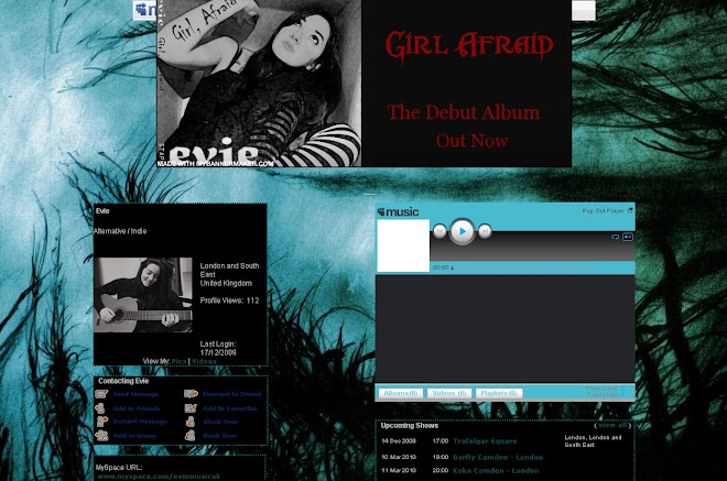
We have decided now that the name of the artist will be Evie and the album cover is called 'Girl Afraid'. We are going to play on the idea of fears with the visuals on the cover of the album as this will tie in with the title and a theme of the music video. We still need to decide on an effective shot for the front cover of the album. We already know that the back will consist of a shot from the tunnel in which a silhouette of the girl can be seen in the distance.
In terms of editing, our video is coming together. We have satrted to put the ending together with the footage that was shot at the reshoot at the weekend. One option was to have the girl walk away with the the mask attached to her foot by string. However we did not like the look of this and after getting some similar negative feedback decided to have quick cuts of the girl getting up from the floor after the 'spark' bit putting the mask on. Originally the spark bit would have been the ending but we though it was not dramatic enough.
Apart from this there aren't many major issues or gaps. We did have a small gap at the beginnning where we planned to put together quick snap shots of the rest of the video. We got some feedback from Ms Blackborow who didn't like this but suggested we introduce the girl to the audience with some shots of her in the tunnel. We working on this at the moment too.
Sunday, November 22, 2009
Trent Park Reshoot
Unfortunately I was too ill to go to the reshoot at Trent Park. The main thing left to shoot was the ending.
It's been raining quite a lot today but I'm hoping this didn't effect the shoot and that it went well.
I will try to come into school tomorrow if I'm feeling better as we haven't got long till the deadline.
It's been raining quite a lot today but I'm hoping this didn't effect the shoot and that it went well.
I will try to come into school tomorrow if I'm feeling better as we haven't got long till the deadline.
Friday, November 20, 2009
Inspiring Album Covers

We took inspiration from the key iconography of this shot. There is a strong theme of nature with the flowers and birds in the background as well as the colour scheme of green and blue, which connote authenticity and freshness. The lungs on the outside of the artists body are quite surreal and suggest to the audience that the artist is unique and quirky. The way her body is posed with her eyes looking down demonstrate her quirkiness and also makes her stand out from other artists.

The key image on this album cover is quite surreal as the house in the background is reminiscent of a cottage in a fairytale. The bright red and yellow that are prominent in the image reinforce this. The horse imagery is also suggestive of mythical elements and the prominent green in the image connates more natural elements. The daisies also connate a sense of nature and also summertime and therefore a sense of dreaminess. Both these qualities suggest that as an artist Kate Nash is unique and different with an element of authenticity.

The image on this album cover has a cartoon/animated effect on it. It is very simple as is the colour scheme and the animated artist is dressed simply and is not groomed which suggests that she is again authentic and that her music is in a sense 'real' and sincere.
Thursday, November 19, 2009
Editing, Album Cover and Myspace Page
We are getting even closer to our deadline with only about a week to go. I have summarised our progress so far in terms of all three products.
Editing
It is going well so far, but we only have a week left and still don't have all our footage! We are going to reshoot this weekend and I think we have enough time to edit the new footage. The only thing left is the ending. So in the meantime we have been working on the rest of the song. We were trying to listen to the lyrics and so when the song says 'I'm taking it slow' we have deliberately edited at a slower pace. We have also been adding more effects such as cross dissolves at this point in the song and at the beginning to make it more dreamy.
We need to get feedback from a teacher next week to find out if anything needs changing.
Album Cover
At the moment we are still planning and discussing our ideas for the fornt of the album. We already have the shot for the back, which is a ELS of Mia in the tunnel where only her silhouette can be seen.
For the front cover, we have been looking at album covers from the same genre as our song and artist, which is alternative/indie rock. We want to convey the genre and therefore have been analysing their signiifers. The main convention is that the image and style is unique and often abstract and weird.
Some of our ideas have been based around mythical imagery or images associated with nature such as trees. One idea was to use the silhouette of tree branches. We do not want to use an actual photo of a tree but only a image that is almost cartoon like. However, with a photo of Mia alongside this the feedback we have got is that it would be weird.
Myspace Page
We have not decided on the name of our artist and so have not created a Myspace yet. However, in preparation for the creation of it, we have looked at the myspace pages of other artists such as Kate Nash who we have taken much inspiration from. Her page is very personal and she has put a lot of herself and her personality into it. We like this idea and have decided to try and do something similar for our artist's myspace.
Wednesday, November 18, 2009
Panic At The Disco - I Write Sins Not Tragedies
I have decided to analyse this music video as we used it for inspiration earlier on in the project. The video is concept based and quite abstract. It's a great music video to analyse. There is a sense of a narrative and also some very convincing performance.
The video starts off with a normal situation - a wedding. The main performers is dressed in a red suit and holds a black stick and may represent some sort of a circus instructor. Pretty soon into the video we begin to see the quirky and weirder side to the video. Quite early on some performers who resemble circus performers but who are all quite strange and some creepy characters. They all seem to dance quite theatrically and sometimes aggressively. The main performer begins to direct his anger towards the groom. Finally he drags him outside where he witnesses the bride kissing another man. At this point there is a transition and the groom is now in the outift the main performer was originally wearing. This may represent a shift in his knowledge and awareness. Now that his eyes have been opened, he is no longer ignorant or in the dark. The whole narrative and concept matches the lyrics as can be seen with the line 'It's much better to face these kinds of things...' and whole idea of revealing the truth to the groom.
At 0:28 we are introduced to the quirkiness of the video with the wedding guests with white painted faces.
0:31 This is a really creepy shot where the quests simultaneously look at the camera.
0:36 Editing to the music (Andrew Goodwin) is visible here. As the beat kicks in the main performer smashes the door open and suddenly many strange character enter the room. So it signiifes the entrance of these weird, almost surreal characters.
0:41 Weird aspect of the video. These strange characters are juxtaposed with a normal, worldly situation.
1:00 Here the visuals match the music. As the music gets quieter the mad characters also calm down and sit down at this point.
1:15 We took major inspiration from this shot as the make-up is successfully extremely creepy. We decided to use the big red grin on our masked person. The white mask creates a similar effect to that of the white painted face.
1:28 This is another shot we took much inspiration from as we used a similar shot with the masked person blowing glitter out of her hand. In our video, this can be seen to symbolise the masked person's attempt to win over the main girl or equally it could be seen to represent the power of the masked person, or the part of the girl's self that it represents, and effectively the hold it has over the girl.
1:30 This shot is quite disturbing. I particularly like how make-up has been used to make the audience feel uneasy.
1.38 Over exposure this shot goes really bright. We tried experimenting with lighting and over exposure in our video.
1.43 - At this point the shot goues blurry and slightly out of focus. We have tried experimenting with focus and I think the blurry effect is effective in making the audience lost and confused.
1.45 - LA shot kicks towards the camera shows that he holds the power. Again, aimilarities can be drawn between this aspect in this video and ours, in which the main girl struggles to maintain the power against the masked person. In the tunnel, there are particular shots where the main girl sings into the camera and seems to be fighting hard to regain her power as can be seen in her facial expression.
The section after this is all edited to the beat and is again the visuals match the music. In this part of the sonag, people are dancing and being aggressive as can be seen on their facial expressions. There are random flashes at for instance 1:53 and this is something we could try to as there is a running theme of light in our video.
Hand held camera creates a sense of disorientation. This is evident at 1.55. We have tried to create something similar in some shots in the forest.
3:02 Fire is another link between our video and this video as we have used fire spinning in ours. We also have a shot where the fire almost blows upwards and this matches the music and beat in ours.
Sunday, November 15, 2009
Editing Progression
The editing is coming along really well as we are steadily filling the gaps in the timeline. The footage from our reshoot in the tunnel, which we have captured and begun working on, is looking really good.
Now that we had the right footage, I have been working on the start of the sequence. Parts of it look good but the angles of the shots of Mia lying on the ground in the tunnel and forest do not match. As the shots are next to each other this is a problem. We are currently deciding whether we should have another reshoot or solve the problem in editing. We are holding a reshoot at Trent Park, but we all like the angle of the shot of Mia waking up in the forest and so ideally would reshoot the shot in the tunnel.
I have been trying to edit to the music and beat more this week. With the idea of trying to match the visuals with the music, we have also put other key shots onto the timeline. For instance we have a brilliant shot of the fire spinning when the beat kicks in.
What we have done so far looks quite different to how I imagined it would, but it still looks really good – possibly better!
Monday, November 9, 2009
Tunnel Reshoot
We had our reshoot at the tunnel yesterday and it went really well! We met fairly early at 10.00 and the weather was good so it was quite light outside. We got all our shots and finished quite early. We didn't come across any problems and things went quite smoothly.
I watched some footage back today and its looking good!
I watched some footage back today and its looking good!
Saturday, November 7, 2009
Leona Lewis - Run
I have decided to analyse this music video for the single 'Run' by Leona Lewis. We are currently editing and having a reshoot soon so I thought we could gain some inspiration from it. The setting is the same as ours as it is in a forest. I also like the extremely effective use of and experimentation with lighting as well as the editing throughout the song. However, compared to our song, the genre is different and so is the theme.
At 1:09 I particularly like the gradual fade, which ties in with the music that changes at this point. There is also a fade at 0:48 and up until this point the video features one long take. This is extremely effective in building up tension and setting the atmosphere. The fade also matches the song which is quite slow and sad.
At 1:11 the extreme long shot is then contrasted with a CU of the artist at 1:16 which is again very effective.
At 1:33 there is a fade to lack which again matches the music which gets quieter a this point. We have quite a few pauses in our video but I think we will use those for some interesting shots and editing as the rest of the song is slow and so will will use slower shots or fades at other points.
I really like the shot at 1:39 where the camera moves around a tree, which remains out of focus as the artist stays in focus. We have already experimented with the camera by chnaging focus on our last shoot. I also tried this shot and will bear it in mind for the shoot.
1:44 - There is a red tint to the shot and I think we tried something similar to this effect by using sweet wrappers (purple, green and pink as can be seen on the group blog) as we have tried to experiment with lighting and exposure etc. I really liked what we did because it really tied in with the dreamy effect we were going for as it looked quite surreal.
At 2:05 there is a really cool flicker effect with the light that we could perhaps try out as it would add to the confusion and sense of being lost that we are trying to convey in our video.
There is an amazing shot of sunlight streaming through the trees at 2.56 which is visually extremely effective. I think we need lots of footage of something similar. We could also have some shots where the camera is spinning or moving really fast to reflect the main girl's madness and sense of confusion.
3:03 - There is a few flashes of light that is tinted slightly red that looks really cool. We could try out this effect as we are trying to experiment with light and the colour red could reflect the extreme emotions, such as passion and obsession, that we are trying to convey.
At 3:12 there is a handheld shot that I particularly like.
At 3:22 to 3:23 there is an interesting shot which is an ECU of the artists eyes. The shot then goes really bright. We were already thinking of using an ECU of eyes and I think we could use exposure to get a really bright shot.
4:07 - Another really shot of light streaming through trees and surrounding the artist.
The shots in this video are generally quite long, which will be very different to ours as most of our shots seem to be quicker, even though some will be longer.
Wednesday, November 4, 2009
Editing: Progression
Now that we have footage from all our locations (although we are not going to use all of it) we have started editing. We captured the footage on Monday and Tuesday and then began putting together sequences.
We began working on was the sequence of the main girl waking up. We wanted swap between shots in the tunnel and forest using graphic matching but we found that the footage of this in the tunnel did not work or match with the one in the forest, which we much preferred. Therefore we will have to have a reshoot in the tunnel.
I began putting shots of the main girl walking in the forest and then also shots of the masked figure without properly revealing her.
So the editing is going well! Once we have the correct footage it will come together much better.
Sunday, November 1, 2009
Shoot 2 and 3: Grovelands Park and Trent Park
Thurday 29th October - Grovelands Park
Friday 30th October - Trent ParkCostume
MAIN GIRL (Mia)
Black/silver dress
Make-up - natural, more subtle (eyeliner, eyeshadow etc)
Converse
MASKED PERSON 1 and 2 (Selina and Mary)
Faded blue jeans
Black suit jacket
White mask
Make-up - Red lipstick (for Selina)
Props
Black stick
Sparklers
Problems/Lessons Learnt
We arranged to meet up at 1:30 for this shoot and it took a fair amount of time for the actors to get ready so by the time we actually started filming it was fairly late and therefore getting dark quickly. We coudn't shoot much as it was getting dark and we didn't have the paglights either.
At this shoot, we did get some incredible footage of Matt fire-spinning, which looked really cool on camera, so I'm looking forward to seeing it at school on the computer.
We learnt our lesson about arranging to meet to late and for the next shoot the next day we arranged to meet earlier at 12. We also managed to get the paglights in case we needed them, which we did.
Originally we were going to have one main masked person (Selina) and two background masked people (Mary and Matt). However, Matt couldn't make it to the shoot on Friday but we decided that we could shoot our footage without him. We shot some footage with Mary in it as a background masked person but may not use it in the real video as it might look random with just one and Selina may no longer look like the main masked person.
I think both shoots went well and we definately have some footage we can use from both shoots.
We will have to reshoot at the tunnel as the footage we got from there needed better lighting. So next time we will film in the day and make sure we have the paglights.
Wednesday, October 28, 2009
Shoot 1: Tunnel in New Southgate
Yesterday we had our first proper shoot and it was actually quite productive as we got a lot of the shots we wanted.
Costume
MAIN GIRL (Mia)
sparkly silver/black dress
Make-up - Quite heavy eye-make up, predominantly black
Silver and black jewellery
Black sandals
MAIN MASKED FIGURE (Selina)
Faded blue jeans
Suit jacket
Half-face white mask
Make-up - red lipstick
Props
Tealights
Candles
Smashed mirror
Black stick
We decided that the shots in the tunnel would be where Mia would lip-synch, which is what we did. We filmed some static shots for instance a MCU of Mia sitting against a wall and static shots at the end of the tunnel with Mia walking towards and away from the camera. We also did the same shot with Selina as the masked figure.
We also got some handheld shots of both the main girl and the masked figure. For some shots, we placed the tealights in a circle with Mia in the middle and a mirror. We got some shots of the masked figure in the reflection of the mirror. Reflections is also going to be a reccuring theme in our video so it was important ot use the mirror. We also used the tealights along with the candles in other shots by placing them along the sides of the tunnel. Mia then walked through the tunnel stopping to look at the flames every so often. This looked really good on camera.
Problems/Lessons Learnt
Main issue: lighting!
We may have had a problem with lighting (will have to watch the footage back to be certain). We knew this might have been an issue as we didn't have any paglights to gain more lighting.
We also haven't got all the shots we need from the tunnel. One of the main shots we need is of the main girl smashing the mirror so that there are broken bits of the mirror scattered everywhere. We also now need to get a new mirror.
Costume
MAIN GIRL (Mia)
sparkly silver/black dress
Make-up - Quite heavy eye-make up, predominantly black
Silver and black jewellery
Black sandals
MAIN MASKED FIGURE (Selina)
Faded blue jeans
Suit jacket
Half-face white mask
Make-up - red lipstick
Props
Tealights
Candles
Smashed mirror
Black stick
We decided that the shots in the tunnel would be where Mia would lip-synch, which is what we did. We filmed some static shots for instance a MCU of Mia sitting against a wall and static shots at the end of the tunnel with Mia walking towards and away from the camera. We also did the same shot with Selina as the masked figure.
We also got some handheld shots of both the main girl and the masked figure. For some shots, we placed the tealights in a circle with Mia in the middle and a mirror. We got some shots of the masked figure in the reflection of the mirror. Reflections is also going to be a reccuring theme in our video so it was important ot use the mirror. We also used the tealights along with the candles in other shots by placing them along the sides of the tunnel. Mia then walked through the tunnel stopping to look at the flames every so often. This looked really good on camera.
In terms of performance, both our actors performed extremely well and soon really got into their role, so there are no problems there!
Problems/Lessons Learnt
Main issue: lighting!
We may have had a problem with lighting (will have to watch the footage back to be certain). We knew this might have been an issue as we didn't have any paglights to gain more lighting.
We also haven't got all the shots we need from the tunnel. One of the main shots we need is of the main girl smashing the mirror so that there are broken bits of the mirror scattered everywhere. We also now need to get a new mirror.
Friday, October 23, 2009
Idea Development
We have developed our idea quite a bit from the original idea we had. After having talked to Ms Blackborow we developed our idea even further.
We are going to use three locations: the tunnel in New Southgate, Grovelands park and Trent Park where there are thinner trees. We have decided not to use another plainer location like the black room we initially wanted.
We are currently trying to resolve the issue of the length of the song. The song is over 5 minutes long but we must cut it to at least 3 mins 30 secs. We were originally going to cut it and after Mia and Selina tried doing this they found it was still too long as it is still over 4 mins.
The very first shot will be a few bright lights in darkness perhaps out of focus. We have decided to have the main girl, played by Mia, initially be asleep but stirring in the tunnel and then in the forest where she will wake up. At this point she is entering the forest through another tunnel we found in the forest part of Grovelands park. She will then unknowingly be led by the main masked figure through the forest. In between we cross-cut to shots of Matt fire juggling. We will also cross-cut to Mia back in the tunnel, using a ECU shot of Mia's eyes closing before going to the tunnel shot. Mia will only lip-synch when in the tunnel.
Miss suggested that we should perhaps focus on reflections throughout the video. She suggested that in the tunnel there might be unusual things that wouldn't normally be there like a mirror or perhaps the shattered pieces of a mirror. She also said that perhaps at the beginning Mia should be looking at her body as this would tie in with the idea of self-discovery. There should also be a lot of focus on skin at the beginning with plenty of CU shots.
Near the end of the video we will cut to shots of Mia standing by a lake with shots of her reflection in the water. We have decided that at the end of the video we will have shots of both the main girl (Mia) and the lead masked figure (Selina) graadually getting closer to each other whilst mirroring each others actions. Finally their hands will touch and at this point we will add the effects of sparks when they touch. After this point we will use graphic matching where their actions match each others so that it appears as if they are the same person. The final shot will be of Mia, having dropped the mask, walking away with the camera on the floor and tilted to one side so the shot is a long angle.
Thursday, October 22, 2009


Monday, October 19, 2009

Friday, October 16, 2009
The History of Music Videos
We recently had a lesson on the history of music videos that I found particularly interesting. So I have decided to summarize some of what I learnt in the post.

1920s and 1930s
The history of music videos can be dated as far back as the 1920s in
Soundies 1840 - 1846
Soundies are an early version of music videos, usually three minute musical films that were displayed in Panorams. Panorams were coin-operated film/video jukeboxes used as entertainment in bars and other entertainment and amusement centres. They covered all music genres and are perhaps best known for their exhibiting of African-American artists who had fewer opportunities to perform at live venues.
1960s Scopitone
The first scopitone was made in
- Choice was built in.
- Films were in colour rather then black and white.
- Individual selection
- Play and rewind options
The videos shown were usually song and dance performance that were shot cheaply and the consisted of high levels of female display. These films were a pre-cursor to the overt sexual displays of contemporary music videos. They were produced in the
1975 - First Official Music Video by Queen – Bohemian Rhapsody
The rise of Music TV 1981 – 2003
Initially there was a British invasion of Pop acts that filled video airplay on MTV to break the American market. Soon American artist followed suit as they realised the potential of the medium. There was at first a dominance of white, male rock artists based on the assumptions of the producers about the demographics of the audience, namely that the audience was also dominated by white males.
Other than Michael Jackson who had success with his singles Thriller and Bad both of which had successful, high budget productions, black artists didn’t break through until the end of the decade. Reluctance to play black music videos meant rap videos only attracted small budget and didn’t find a mass audience at first. ‘Walk This Way’, the crossover by Run DMC and Aerosmith as well as the humour of MC Hammer and Coolio helped make gangsta rap more acceptable and so eligible for bigger budget videos. Hype Williams, a music video director, led the way for black artists and director in the music industry for more extravagant productions. Higher budget videos generated better record sales and meant that hip-hop now replaced rock as the dominant music form.
Eventually serious rock artists realised the importance and effectiveness of music videos. Bruce Springsteen, who was considered the ultimate to other rock artists, led the way with his 1984 video for ‘Dancing in the Dark’.
The Establishment and Development of the MTV Brand
By 1984, MTV had established itself as central to the music business and started up the Video Music Awards, its very own Oscars. MTV, now owned by Viacom, diversified and established VH1, a more album orientated channel for older audiences. MTV Europe started up and was a great success as Europeans were keen to get same benefits as Americans.
Music videos along with MTV and the introduction of the CD were considered responsible for the revival of the Music Industry. It improved sales and established image as a key factor in the promotion of an artist. By the end of the 1980s music videos were a pre-requisite in the promotion of singles.
The Present Day and the Influence of Technology
Music videos first appeared on the internet on chat/networking sites having been digitised form TV recordings, uploaded and shared.
1997 - I-film launched
1999-2001 – Napster launched
2005 – The launch of Youtube. Faster and easier viewing than sharing sites.
2007 – Myspace video functionality added
2007 – Royalties issue
Google and Youtube reassured the music industry they would ensure fairness so that artists got their cut. However the issue was complicated as some labels welcome the development viewing it as free advertising while others see their music video as ‘the product’ and so they must protect their product and profits as much as possible.
Various artists have achieved fame and success through videos first becoming known online only. Example: Ok Go 2005 ‘
MTV – online streams of music videos
AOL – streams with supporting advertising
I-tunes – offers free music videos and sells them to view on video i-pods.
Viewer-generated content
Literal music videos, lip dubs and mobile phone clips from live performances.
Guerrilla filmmaking – An alternative to the mainstream. Refers to a form of independent filmmaking. Characterised by low budgets, skeleton crews and simple props. Scenes are often shot quickly in real locations without any warning. Usually made by independent filmmakers who don’t have the budget to obtain permits, rent out locations or build expensive sets. Example: Vincent Moon ‘The Take-Away’
‘Guerrilla filmmaking is driven by passion with whatever means at hand.’ -
Monday, October 12, 2009
DYM MYSPACE FEEDBACK
Excellent work, Bhavika. Some very good evidence to suppport your marketing research.
Gwen Stefani – Love Angel Music Baby
For the deconstruction you will need to explore the following:
images used (layout, colour, style etc)

Back
images used (layout, colour, style etc)
Front
Vivid and colourful
A medium long shot
Main colours used – gold, pink yellow
White background with a gold border
Gwen Stefani sitting on a gold throne in the centre directly addressing the camera
Head tilted up slightly and to the right
Curly messy hair – looks careless and so ‘cool’
Wearing a white top with frills, grey jacket with white fur, denim shorts, tights
Holding a gold purse and stick – link to royalty
Gwen Stefani is in focus but the surrounding images are out of focus
Slumped in the throne, one eye hidden, looks very laid back, relaxed, careless and so in control
Signature look – dark red lipstick, blond hair
Surrounding image – two Asian girls standing and posing
Back
Dark red background
Image is to the left has a white background
Image in black and white
Gwen Stefani sitting on same throne but more upright
Head tilted down to the right.
Curly even messier hair – looks careless and so ‘cool’
Eyes half closed – still looks chilled out
Big black stilettos
No longer wearing the grey jacket
Holding a tiara – connotations of ‘royalty’
Holding a stick – link to royalty
text (fonts, size, positioning, colour etc)
Font colour – gold
Album title in top left top corner and name Gwen Stefani in bottom right corner
Album title fairly small, Gwen Stefani much bigger and in bold
Font used is distinct, fancy style, connotations of royalty and ancientness
The relationship between text and images - how do they work together ie anchorage Differing functions of the front, back, inside sleeve
Anchorage - The text has connotations of royalty in the image, Gwen Stefani is sitting on a throne
The text, the throne and the border are all gold
How the Iconography represents the band, the genre of music and their overall image.
Iconography represents Gwen Stefani as individual and distinct
Colourful iconography is colourful and reflects the genre of pop, which consists of catchy dance music that is fun
Gwen Stefani’s image consists of her dark red lipstick, blond hair and her wild/different/out there fashion sense
Overall image is quite fun
Are there any signifiers exclusive to the band/ genre
Colourful and fun – pop genre
Signature look – dark red lipstick, blond hair, quirky dress sense
What the cover says about the institutional context of the music ie the label, mainstream, underground, first album etc
Owned by Interscope Records, licensed to Polydor Limited, Universal Music
First album as a solo artist?
What can we learn about the potential/target audience from the cover ie specialist, niche, familiarity with the band, compilation, mainstream etc.
We can learn that the target audience is mainstream, as the cover resembles other mainstream pop artists/bands, as it is colourful, fun etc. However, it is also individual to suit Gwen Stefani’s style.
Any work completed on album covers should be posted on your individual blog, with links to the album cover imagery
STAGE 1: ALBUM COVERS RESEARCH
A: Look at a selection of album covers (minimum of ten, CD or vinyl), maybe from your own, your parents or a friends collection, or online - the more variety in genre, style, decade etc the better. Make notes in answer to the questions below:
1. What are the typical features that an album cover has? Make a list of all the elements they have in common.


1. What are the typical features that an album cover has? Make a list of all the elements they have in common.
Front, back and spine
Name of the band/artist – usually bigger then title
The title of the album
Typeface – visual motif same font
The artist is usually on the cover
The image is strong and iconic: Lady Gaga - The Fame
Marketing stickers
Price labels
Offers
The tracks on the CD
Institional information - The record label, copyright symbol, publisher, designer date etc
Certain expectations – legal licensing fro industry etc
Artist/band website
Record label website
Bar code
Same design and colour scheme on front and back


Name of the band/artist and the title of the album on the side
Booklets
Distinctive debut albums – sell the artist/band
Second/third etc albums - work on familiarity
Greatest hits – play on nostalgia using iconic images of the artist/band, work on an emotional response
2. How would you categorise the covers in front of you? Are there any other ways of distinguishing between them other than generically?
Genre
Target audience
Artist/band
Male/female
Style
Band/artist on the front
Conceptual
Debut/first/second, third etc
Mainstream/alternative/niche
Compilation/greatest hits etc
Tone – funny/serious
Era/decade
Layout
Dual case/digi pack/vinyl album
Special edition/double album etc
Record label e.g. Motown, 2 Tone – associated with a specific genre
3. Album covers serve many different functions. What do you think these are (ie what is their purpose?)
To portray the artist/band artistically
Serves as an identifiable image associated with the artist/band.
To hold the CD
To advertise/promote/sell the artist/band
To advertise/promote their songs and music
Indicate the genre of music and style
Informative – tracks
Genre specific – has to sell a specific genre
Institutional identity
Individual, distinctive, should stand apart
Gets people talking about artist
Subscribe to:
Posts (Atom)